wsuuuuuuuuup ;)

Friday, October 30, 2009

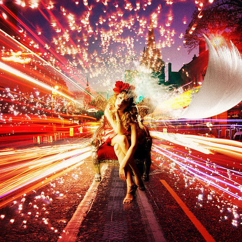
What I like most about the pieces posted below is the use of color. I like a modified and thought-out color scheme that is still vibrant and bright. David Choe's art inspired me to use different materials and re-purpose them to incorporate into my own art. I think that our project would be more interesting if we tried using epoxy to seal in leaves or flowers or anything else to bring different materials into our art. I also like how a few of the pieces are separated into sections. I like that some consist of one continuous picture that is separated into rectangles. To me, it gives a piece added interest and made me look closer at each different section. The piece by Rex Ray has the laminate background which I think gives the entire piece more depth and is a creative background. It inspired me to really consider incorporating the wooden canvas, rather than just covering it with paint. I plan to have the background showing and make it a part of my final piece. I will try using tape and different techniques to add more depth and texture to my final product. I also love how the last piece uses layers. It makes an old image more modern and brings a whole new life into it.


David Choe.


Rex Ray.


Ando Hiroshige


Utagawa Kunisada II.


Utagawa Kunisada II.


Eric Otto.

Wednesday, October 28, 2009

Holiday Matinee Designs

These are my final designs for the Holiday Matinee Project. The first one is a vectored photo that I took of my bike. The second one is a drawing that I made of a boy flying a kite with the string spelling out "Up Up and Away". The last one is a polar bear sitting on a piece of ice saying "WTF".


Tuesday, October 20, 2009

Wednesday, October 14, 2009

Tuesday, October 6, 2009

CULT OF UNCOOL: Artist's Statement

Our goal was to make picking your nose a cool and trendy thing to do. We created a set of apparel and posters to do so. We decided on a brand name, Gold Diggaz, that we used throughout all our designs. We incorporated two taglines, "Make a Gold Statement" and "Pick Your Nose for Peace", that we incorporated into our apparel and poster designs. Our color scheme of golds, yellows, black, and white gave our products a cohesive element. The combination of hand-drawn words and images, orginal photos, and graphics gave a unique look to each design.

CULT OF UNCOOL: FINAL


Monday, October 5, 2009

Quiz #2: Design Basics


Point, Line, Plane.


Scale.


Texture.


Grid.


Pattern.


Rhythm and Balance.


Time and Motion.


Transparency.


Layers.


Color.


Framing.


Diagram.